Task 1: Create an array with hourly demands 200, 220, 240, 260, 280, and 300 MW. Print its shape and datatype.
Notebook Cell
import numpy as npNotebook Cell
demand = np.array([200, 220, 240, 260, 280, 300])Notebook Cell
demand.shape(6,)Notebook Cell
demand.dtypedtype('int64')Task 2: Create eleven evenly spaced temperature values between 15 and 25 degrees Celsius using np.linspace().
Notebook Cell
temps = np.linspace(15, 25, 11)
temps
array([15., 16., 17., 18., 19., 20., 21., 22., 23., 24., 25.])Task 3: Print the first 3 values and the last 3 values of the following array:
demand = np.array([300, 320, 340, 360, 380, 400, 420, 440, 460, 480])Notebook Cell
demand = np.array([300, 320, 340, 360, 380, 400, 420, 440, 460, 480])Notebook Cell
demand[:3]array([300, 320, 340])Notebook Cell
demand[-3:]array([440, 460, 480])Task 4: Convert the following temperature array to a heating energy demand using the formula demand = 1000 - 20 * temperature.
temperature = np.array([10, 12, 15, 20, 25])Notebook Cell
temperature = np.array([10, 12, 15, 20, 25])Notebook Cell
1000 - 20 * temperaturearray([800, 760, 700, 600, 500])Task 5: You have daily demand demand data for 3 days and 3 hours
demand = np.array([[300, 320, 340],
                    [280, 300, 310],
                    [260, 270, 290]])
Multiply each hour (columns) by scaling factors 0.9, 1.0, and 1.1 respectively using broadcasting. What are the dimensions and values of the resulting array? What do the new values represent?
Notebook Cell
demand = np.array([[300, 320, 340], [280, 300, 310], [260, 270, 290]])Notebook Cell
factors = np.array([0.9, 1.0, 1.1])Notebook Cell
scaled = demand * factors
scaled
array([[270., 320., 374.],
[252., 300., 341.],
[234., 270., 319.]])Notebook Cell
scaled.shape(3, 3)Task 6: Consider the following values of hourly wind speeds in m/s.
wind_speeds = np.array([5, 10, 15, 20, 25])Calculate the average wind speed, minimum wind speed, and maximum wind speed using reduction operations.
Notebook Cell
wind_speeds = np.array([5, 10, 15, 20, 25])Notebook Cell
wind_speeds.mean()np.float64(15.0)Notebook Cell
wind_speeds.min()np.int64(5)Notebook Cell
wind_speeds.max()np.int64(25)Task 7: Consider the following values for demand and generation for 8 hours.
demand = np.array([400, 420, 450, 480, 500, 520, 550, 580])
generation = np.array([300, 350, 400, 450, 480, 500, 530, 600])
Create two line plots on the same figure showing both demand and generation over time. Add appropriate labels and a legend.
Notebook Cell
demand = np.array([400, 420, 450, 480, 500, 520, 550, 580])
generation = np.array([300, 350, 400, 450, 480, 500, 530, 600])
Notebook Cell
import matplotlib.pyplot as pltNotebook Cell
hours = np.arange(8)
plt.plot(hours, demand, label="Demand")
plt.plot(hours, generation, label="Generation")
plt.xlabel("Hour")
plt.ylabel("Power [MW]")
plt.legend()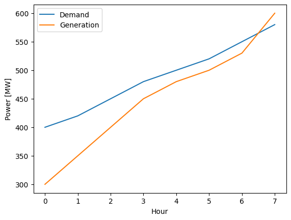
Task 7: Sometimes we want to compare two different variables side by side. Use subplots to visualize the following demand and price time series over six hours.
demand = np.array([300, 340, 320, 380, 360, 400])
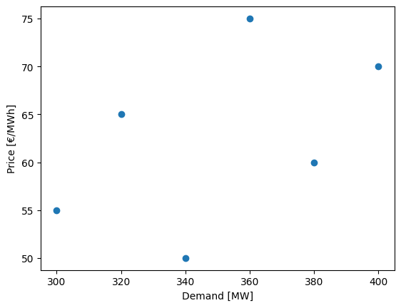
price = np.array([55, 50, 65, 60, 75, 70])Create one figure with two subplots arranged in one row and two columns. The first subplot should show demand over time, and the second subplot should show price over time. Add appropriate titles and labels to each subplot and enable grid lines. Create another separate figure that presents the relation between demand and price using a scatter plot.
Notebook Cell
demand = np.array([300, 340, 320, 380, 360, 400])
price = np.array([55, 50, 65, 60, 75, 70])
Notebook Cell
hours = np.arange(6)

fig, axes = plt.subplots(1, 2, figsize=(10, 4))

axes[0].plot(hours, demand, marker="o", color="tab:blue")
axes[0].set_title("Demand over Time")
axes[0].set_xlabel("Hour")
axes[0].set_ylabel("Power [MW]")
axes[0].grid(True)

axes[1].plot(hours, price, marker="s", color="tab:orange")
axes[1].set_title("Price over Time")
axes[1].set_xlabel("Hour")
axes[1].set_ylabel("Price [€/MWh]")
axes[1].grid(True)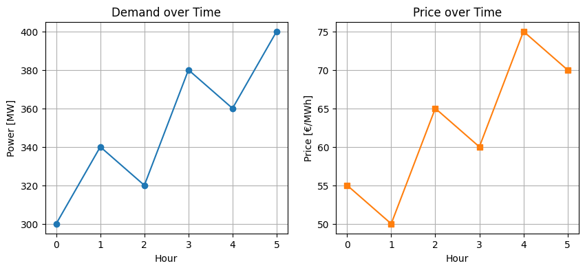
Notebook Cell
plt.scatter(demand, price)
plt.xlabel("Demand [MW]")
plt.ylabel("Price [€/MWh]")